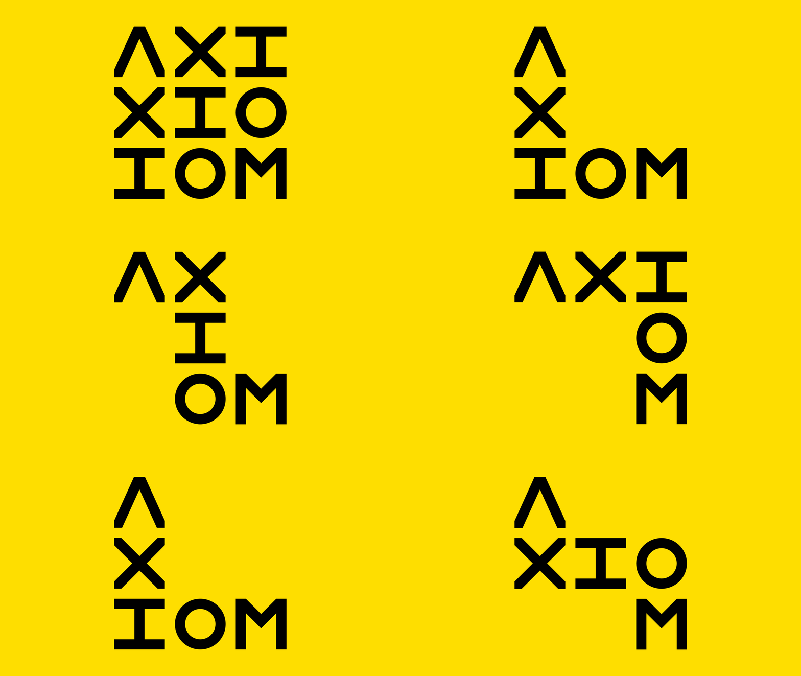
AXIOM is a boutique fitness space in Holland Village (Singapore) offering Indoor cycling and Strength training programs. Tasked to develop the logo, colour scheme and environmental graphics for the studio.
Envisioning classes with a focus on high quality learning and engagement, yet accessibility on all levels. Performance metrics contrasting with a grunge aesthetics formed the core of the brand’s art direction.
BRAND VISUAL IDENTITY
LOGO DESIGN
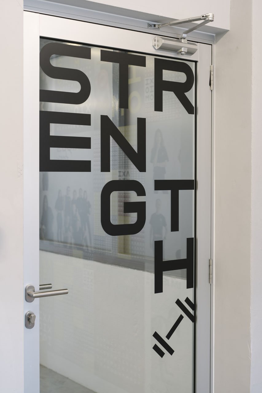
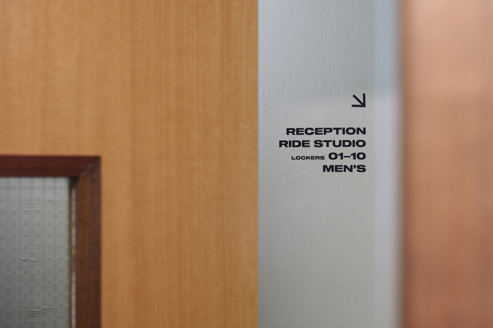
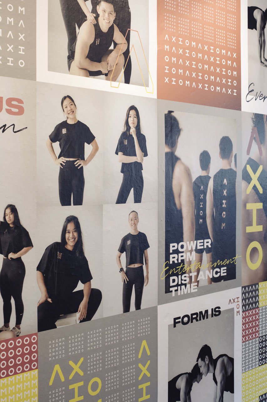
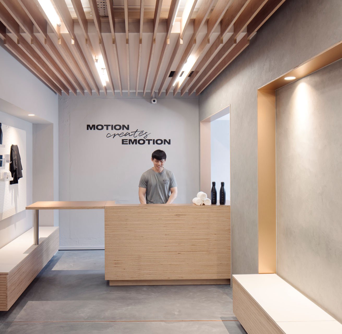
ENVIRONMENT GRAPHICS & WAYFINDING
An identity system that is dynamic and centred on the logo. The letters of the name are set on a 3x3 grid, allowing it to be read in multiple directions.
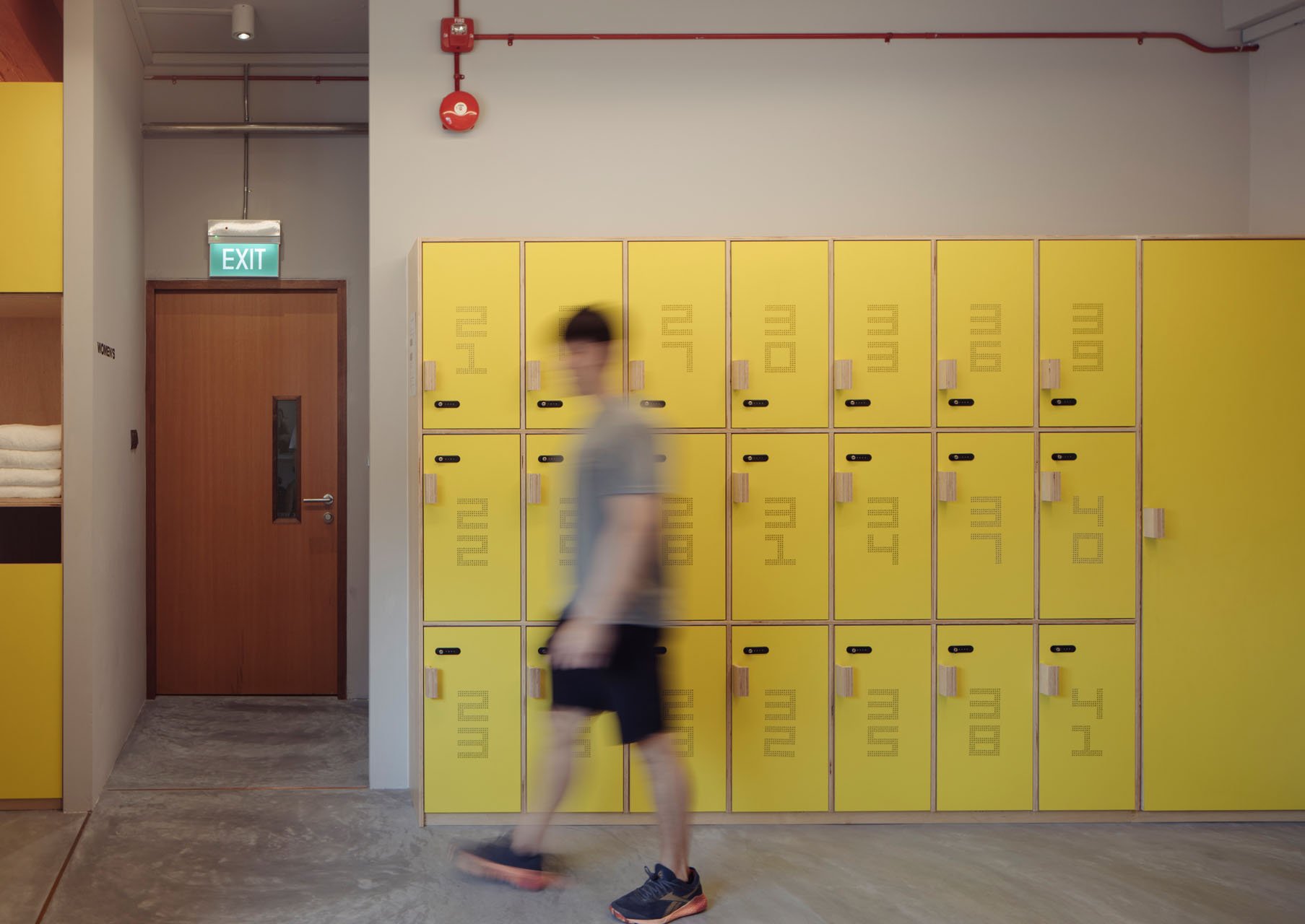
A vibrant yellow colour that pulses with energy alongside copper and grey tones makes up the colour palette — which was applied across spatial and digital elements of the brand.


Credits
ACRE Design Studio
Kaizen Architecture
